Explain to me like I'm 12 - Pt 1
Series: Part 1 of Cozy Builder
Building a tool simple enough for anyone, and the engineering it takes to keep it that way.
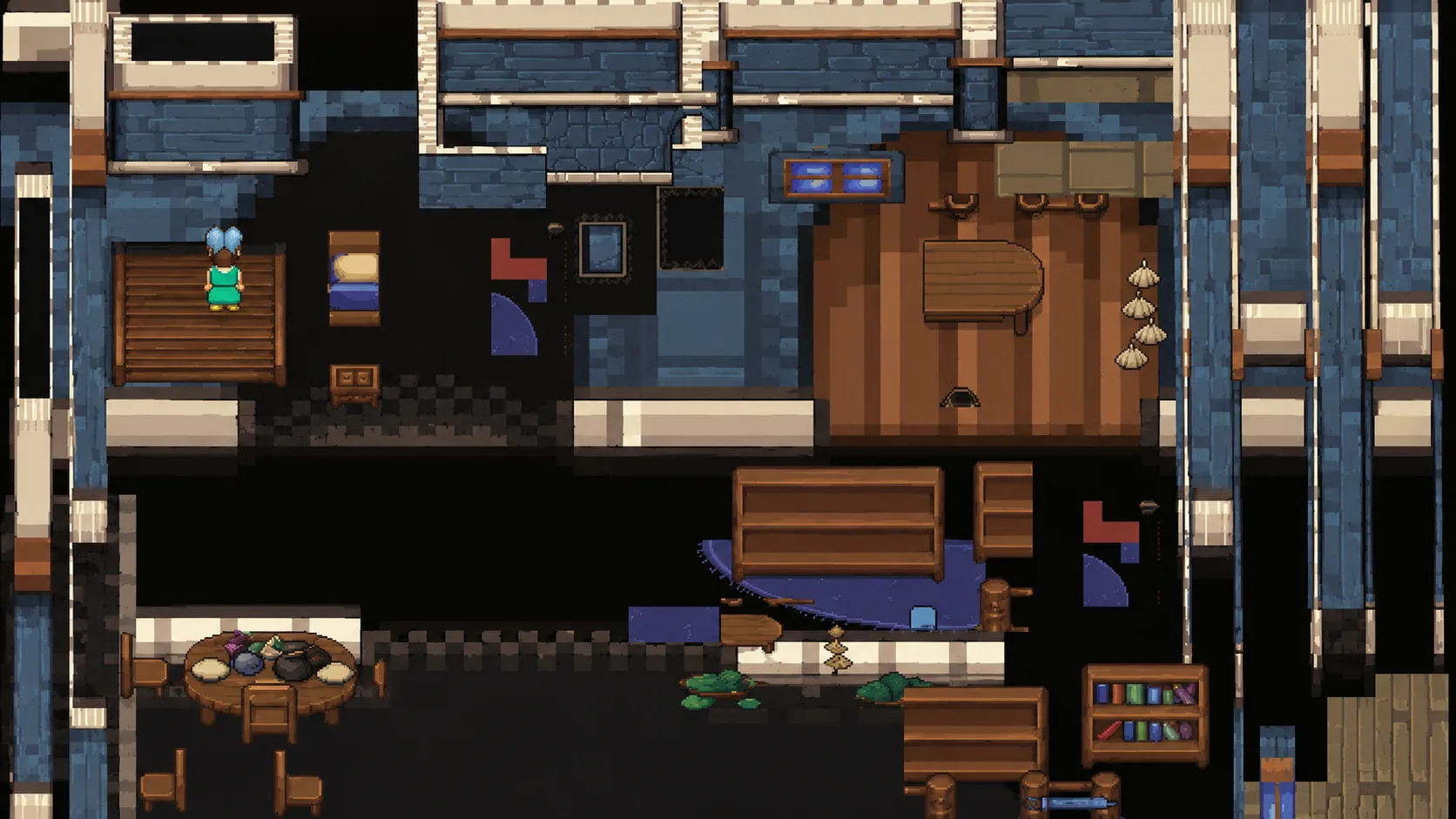
This image, is the result of relying solely on AI to try to build something for you...
I got a surprise day off, King's Birthday, and spent the whole day trying to get AI to lay out a scene. It's for the main one of a couple of projects I've had on the go. I pulled out Claude Code and Codex, figured I'd just ask them to make it, and back came scrambled layouts. Tiles in the wrong place, staircases leading to nowhere, objects clashing into each other, a chicken with no head.
Sure, if you give it a web app layout built out of components, it's wonderfully obedient, it'll happily slot those together. But ask it to map out every single sprite in an image and it loses the plot entirely.
But that mess doesn't prove AI can't do this. It proves the way we're asking it to, right now, is bad. And I want to be precise about that, because it's easy to overclaim.
Sometimes the model genuinely is the limit. Long-term planning, consistency, spatial reasoning, memory, those hit walls no clever UI can hide. But this wasn't that. I was asking a language model to solve a spatial problem through an interface that handed it the wrong abstractions.
A sprite sheet and a grid of coordinates, nothing it could treat as an object.
Off I went looking for tools that could help. They exist, but they're so flippin hard to use. Me, sit and learn another overbuilt tool? Nah. Not when I could build exactly what I needed in the time it'd take to get through the tutorials. There's a reason I'm a UX Engineer dude. By default I look for the path of least resistance, and the apps out there kept getting in my way. So I thought, right, I'll build it myself.
So along came my Cozy Builder.
I'm not revealing the purpose of my main app yet, but I'll share my journey with this. After nearly pulling my hair out, I realised what I really needed. Not me placing every single sprite by hand, but a tool AI could work in. Somewhere it could build the scenes itself, properly, instead of fumbling around a flat image.
So I changed the abstractions. The important part was giving the model real structure to work with instead of asking it to read meaning off a sprite sheet. Once it had that, it stopped guessing blindly and started arranging things it could work with. And this isn't a bet that AI stays bad at this. Even as the models get sharper, structure you can see and trust is what keeps a person in the loop, able to step in and fix things by hand.
I can't make the model smarter. But I can stop setting it up to fail.
And that's really what this post is. Not a finished thing with a bow on it, no look ma, no hands. It's me working through one stubborn challenge out loud.
I'm a UX engineer, so I lead with the experience, always. I started here exactly where I start everything, from how I want it to work. The feel of it, what it's like to sit down and use. That was deliberate, and it's where I've spent most of my time, the side you can see in these screenshots.
The next part, the one I'm moving into now, is making the backend respect that. Working through how it needs to work underneath so it serves the experience instead of dictating it. The want leads, the need follows.
And I should be clear, none of this is simple under the hood. The system is complex precisely so the user doesn't have to be. The surface is what you see. Everything holding it up is anything but, and that's the trade I'm signing up for.
How do you take something this fiddly, scenes and layers and sprites and an AI poking at all of it, and keep it simple enough that someone just gets it, without the whole thing falling apart the minute they do? That's the challenge. I'm in the middle of it. This is where I've got to so far, and where I'm taking it next.
Design for understanding
So, start with the want. For me it always does. The thing I care about most is what doesn't go on the screen. Every button, every panel, every option you cram in is one more thing for someone to get confused by, and one more reason for them to give up.
Here's what I mean. This was the first version of "Cozy Builder".
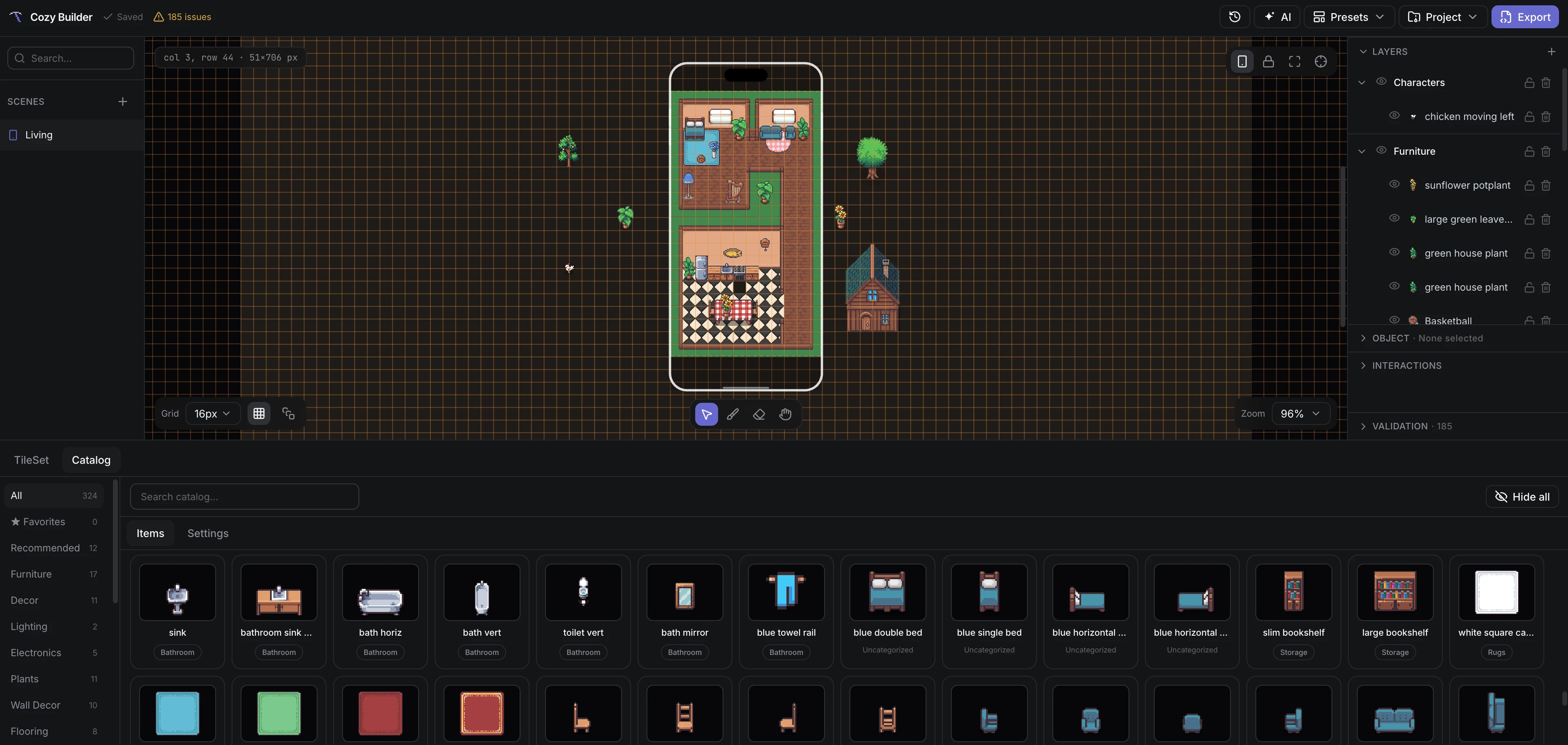
Not so cozy is it? ha. There's WAY too much going on, too many buttons, too many panels all fighting for attention. "Explain to me like I'm 12" doesn't quite match this UI. And worst of all it looks like every other old school "designer / creative" app out there. Ugh.
So I kept it minimal. Dead simple.
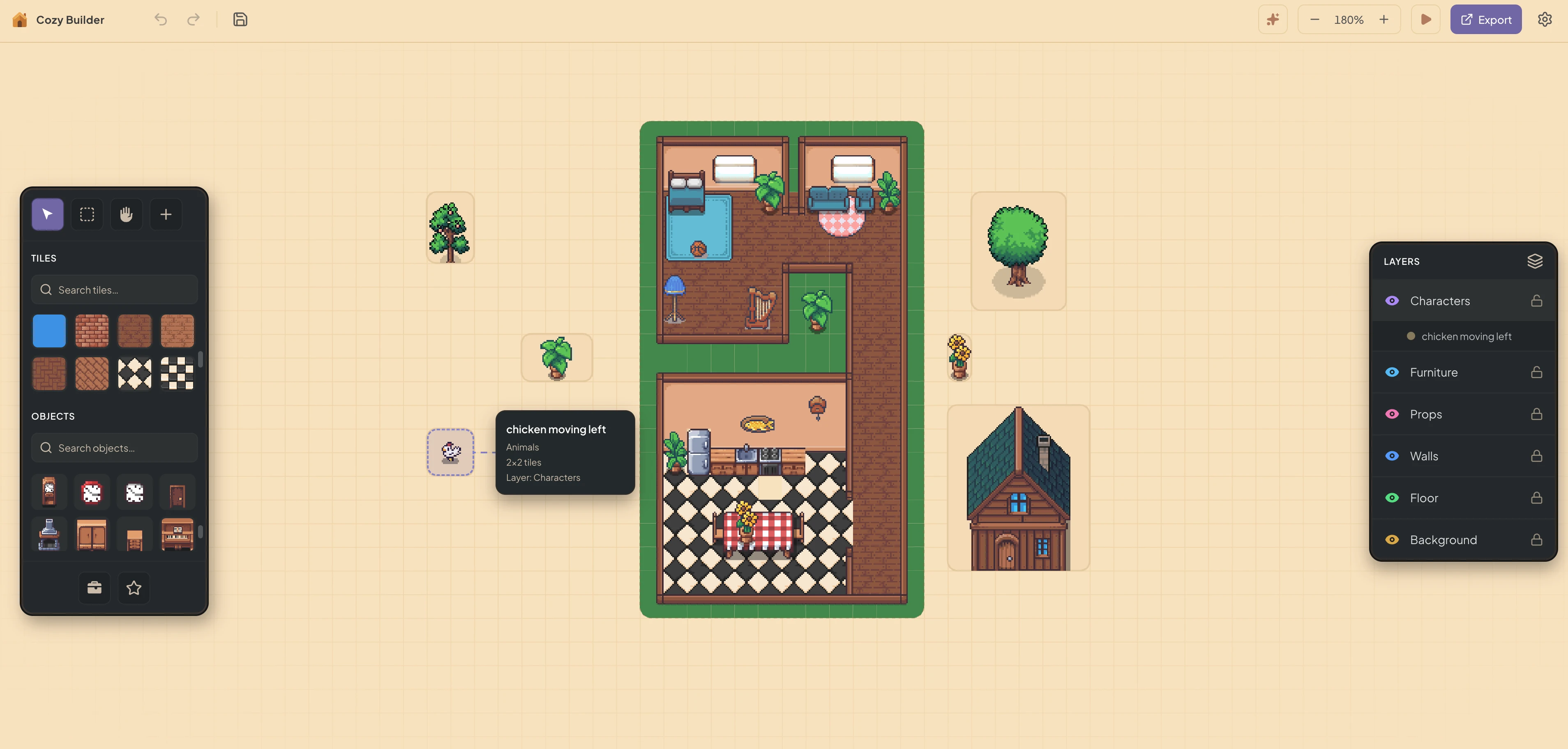
This is the very very stripped down version. It's the kind of thing you open and just get, no tutorial, no figuring it out, no watching some bloke on YouTube explain it. If a 12 year old couldn't pick it up and start playing with it, I got it wrong.
And here's where it landed once I started cutting things out. The warm cream background feels cozy now, and the scene is the hero instead of fighting the panels for attention. Everything you don't need is gone.
It really comes down to one thing. The first version was built around how the software is organised, all my nouns laid bare, scenes and layers and objects and categories. This one's built around what you're trying to make. The first looked like something an engineer built for themselves. The second looks like something a creative would actually want to open.
Here's the part that caught me off guard tho. Cutting the surface down didn't just make it easier for a person. It made it easier for the AI too. Because I'd built the thing around real objects instead of a flat grid of pixels, the model could finally work in here. Not perfectly, but semi well, which is a WORLD apart from where I started.
The same simplicity that lets someone just pick it up is the exact thing that gives the AI something solid to grab onto. Turns out reducing the complexity was the whole game, for both of us.
Because the scene is structured properly now, the AI can actually understand it. Like genuinely get it. Ask the Cozy Companion what it reckons of your bedroom and it can read the scene, see what's there, and tell you what's missing, instead of squinting at a flat image and guessing. That's the whole reason I built it this way.
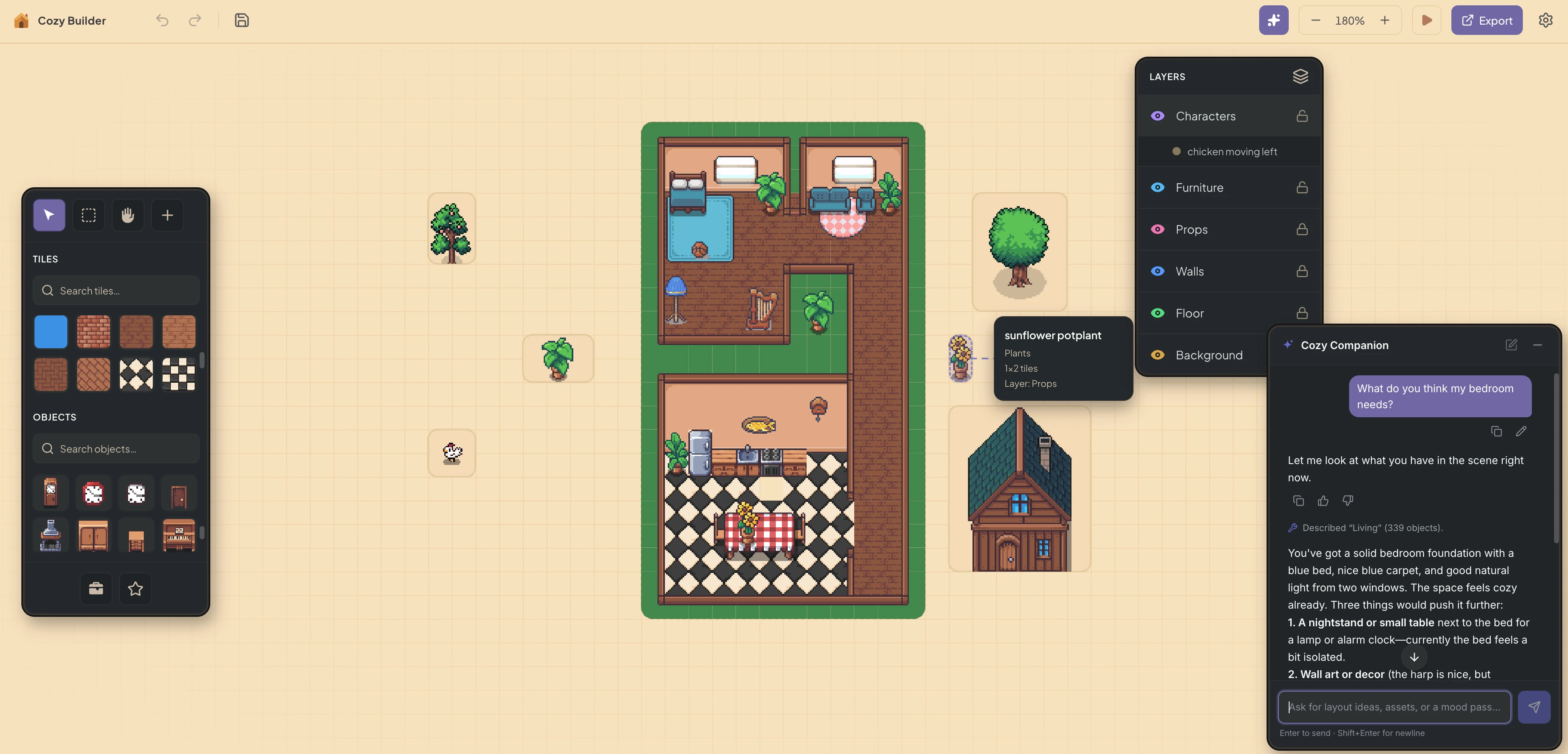
Because it's working with real objects and not pixels, the back and forth goes somewhere. It digs through the catalog, suggests pieces that fit, and proposes dropping them at an exact spot in the scene. You stay in the driver's seat the whole time and just say yep or nah.
That same idea scales up. When the AI builds out a whole layout, it doesn't just dump it on you and hope for the best. It comes in as a draft you get to look over first, so you're never stuck choosing between accepting some messy fifty object scene or binning the lot and starting over. You see it, then you decide. Simple.
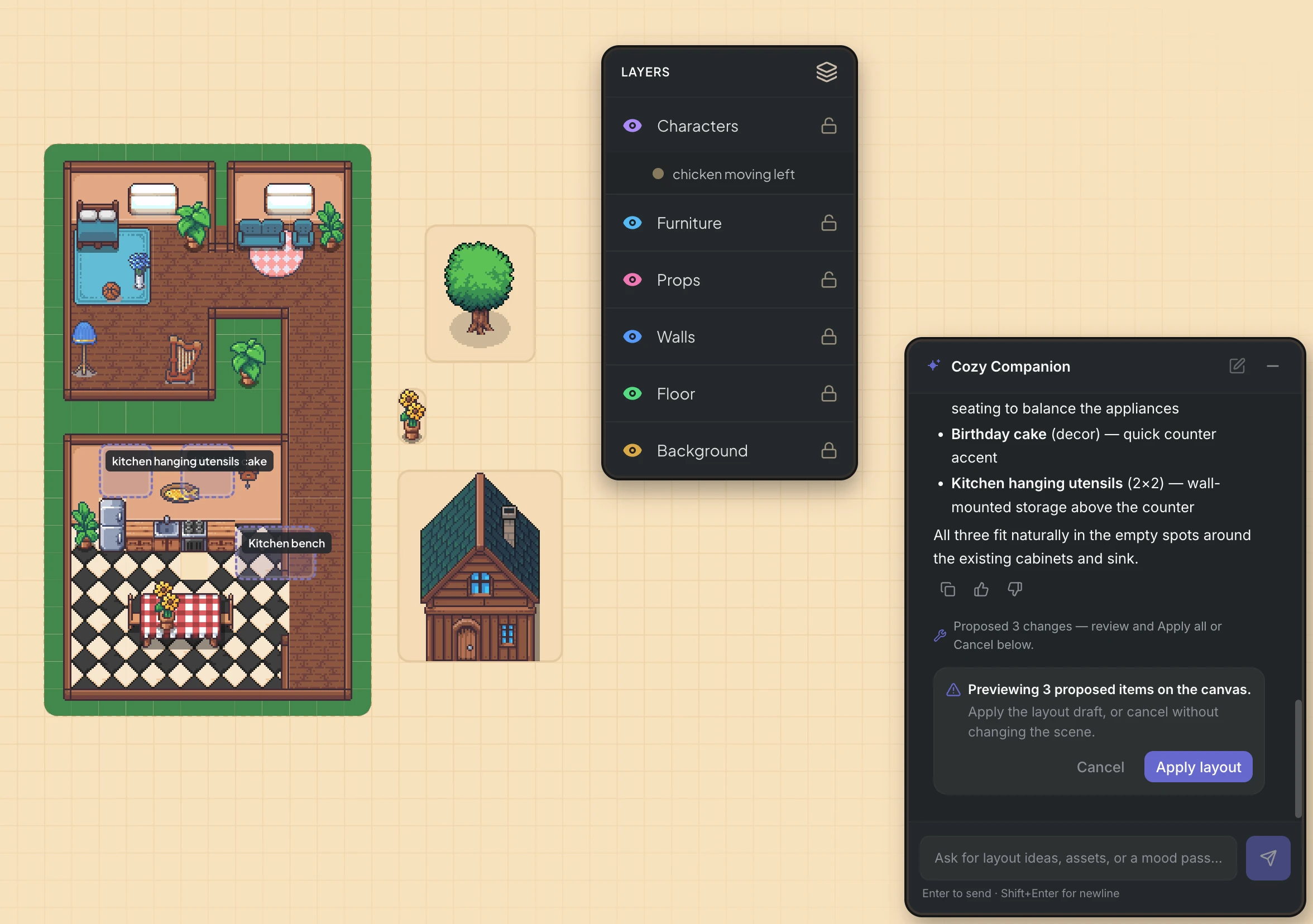
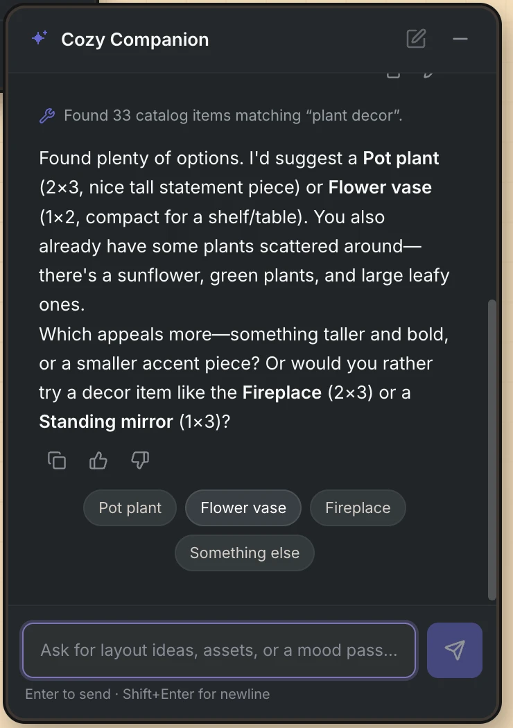
And here it is dropping the blue vase right into the scene.
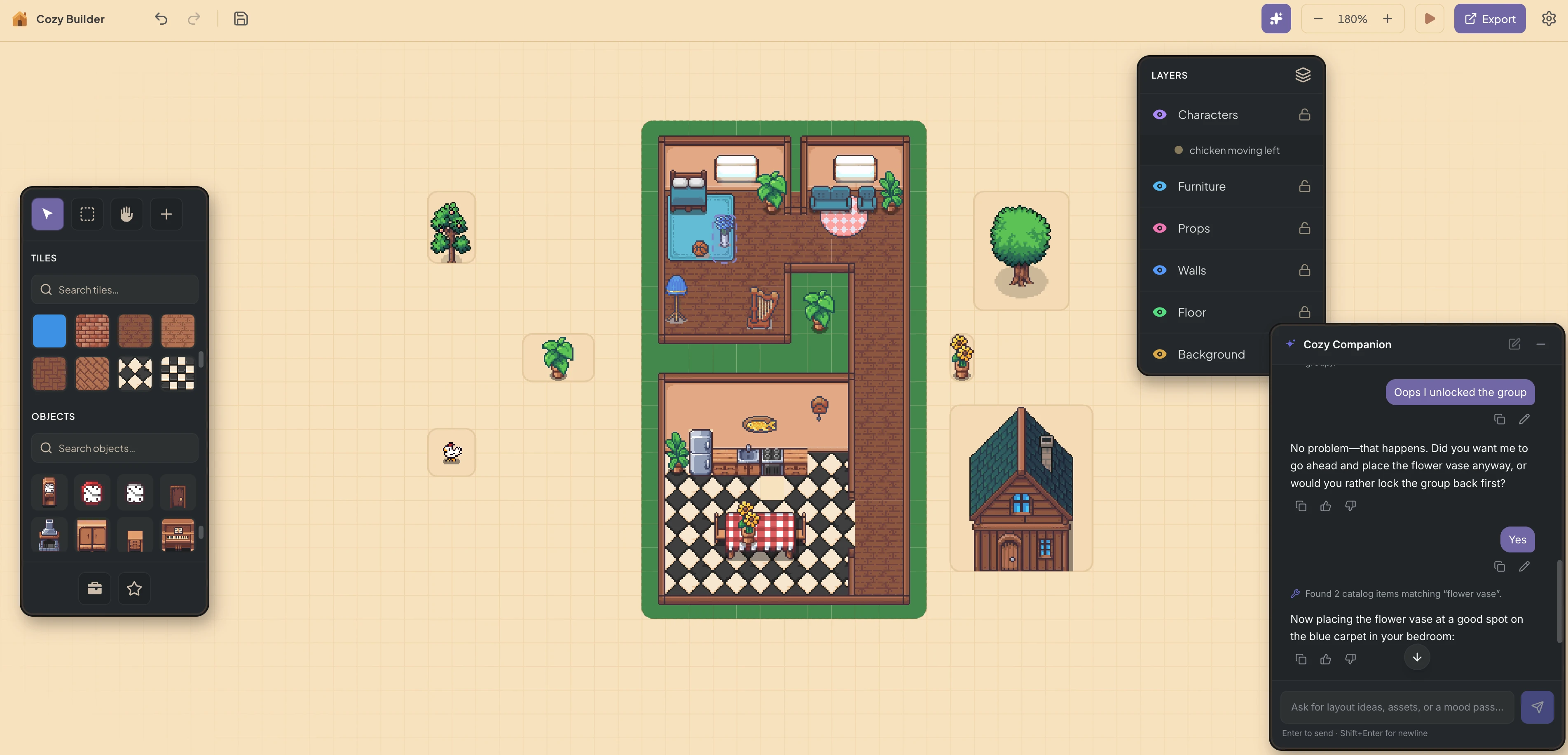
And before anyone panics, simple doesn't mean dumb. Cutting things out isn't the same as ripping the power out, nooo. The depth is all still there, it just shows up when you reach for it. Select an object, from the canvas or the layer list, and its controls come to you, instead of every single control shouting at you the second you walk in.
Right-click a crowded spot and the canvas hands you an "Items here" list of whatever's hiding under your cursor, plus the order controls, bring to front, send back, right there. No diving into Layers to dig something out. The hard stuff stays one reach away, not one panel away.
You don't even have to click to find out what's down there. Hover over a busy spot and a little "Overlapping items" hint pops up showing you everything layered there, top to bottom, so you always know exactly what you're about to grab.
That's the win on discoverability. The hint isn't some hidden trick you have to stumble onto. It shows up the second you hover, so it teaches you the right-click menu is there before you ever need it. No permanent panel, no instructions, you just learn it by using it.
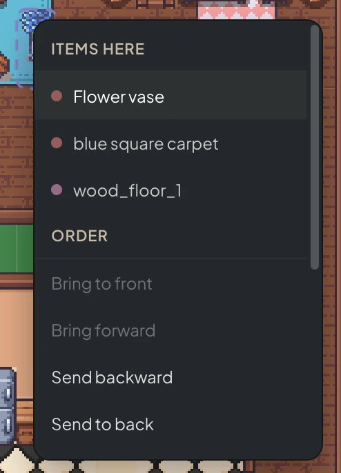
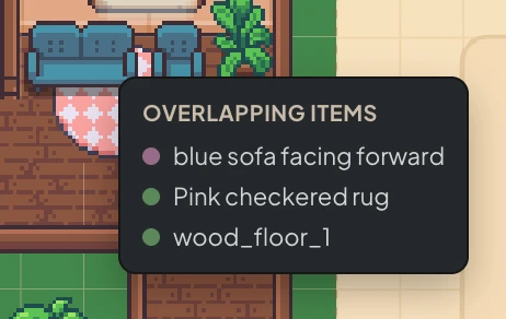
The stripped-back version is for the first pass. The detail's right there as soon as you want to get your hands dirty. That's the whole point of "explain to me like I'm 12". Not because anyone's dumb, but because the best things are the ones you just get.
And look, this is very much a work in progress. There's still a tonne of thinking left to do, and it's nowhere near some solved-forever version. But it feels like I'm pushing it in the right direction.
Take that right-click menu. It's handy, but really it's a safety net. The proper fix is structural, locking objects into categories so a rug can never sit on top of a desk in the first place, which means you'd barely need the menu at all. That's the kind of thinking that's left.
More will get added. It'll just get added the same way, in context, when you reach for it, not bolted back on as another wall of panels.
Here's the seam tho, because the pretty version hides it. That draft preview looks finished, but the front end is a good step ahead of the plumbing underneath. This is the part I mean. The experience is built. Now the backend's gotta earn it. The interesting work was never drawing the ghosted boxes. It's the physics across two states at once, working out how some uncommitted AI suggestion collides and stacks with the objects already locked into the scene, without tearing up the main state that everything else leans on.
The want is what makes it hard, not the code. I don't just want objects to not overlap. I want cozy, tight, organic placement. A chair tucked right under a table, not furniture floating around in little boxes with big awkward gaps between everything. Ugh. Soon as you chase that feel, the obvious engineering answers start fighting you.
I went down a wrong turn first, course I did. Snap placement to a chunky grid so it feels nice, then run collisions on a finer grid underneath so they're accurate. Sounds clever right? Nope. It's a damn trap. You end up showing someone a gap they physically can't click into, and straight up lying to the AI about what's actually free. That's the backend bossing the experience around instead of serving it.
The fix, fittingly, was to make it simpler, not cleverer. One grid for everything. An object's footprint is just the floor tiles it sits on, its shadow on the ground, kept totally separate from the picture you see. A table only blocks where its legs land, so a chair slides right under it. A solid kitchen island blocks the whole lot.
The AI never has to read some giant map of the room either. It just says where it wants something, and the engine finds the nearest spot that fits. Boil the whole thing down to a grid of yeses and nos and it gets cheap enough to check a fifty object draft in a blink, and simple enough that a language model can reason about it.
Same trick as everywhere else in here. Take the scary version and reduce it to something a 12 year old, or an AI, could follow.
There's still a proper rabbit hole under it. Perspective playing tricks on what even counts as the floor in a 3/4 view, how snapping has to feel so things land flush instead of magnetically shoving each other apart. That's the next post. I know how I'm doing it, I just haven't shown it yet. The experience landed first, on purpose, and now I'm building the backend to respect it rather than bolting more on top.
And that's the part I keep circling back to. AI is great at acting inside a structure. Someone still has to build the structure.
The Cozy Builder Series
- Part 1: Explain to me like I'm 12 [You are here]